Friday 31 December 2010

Skeletons

Over the last two weeks I've explored some of London's more morbid museums in search of bones. I'd recommend the Hunterian Museum for anybody interested in human anatomy, the Horniman Museum for animal anatomy and the Wellcome Collection's permanent exhibition for non-anatomical medical curiousities. I'm planning on visiting the Natural History Museum in the new year.

Yesterday I took a break from drawing in favour of a papercraft project from Skull-A-Day.


The lower jaw can be opened and closed, but unfortunately it doesn't quite move smoothly enough.

I'm actually a bit bored of human skulls; they're everywhere at the moment. I'd like to see more spines and rib cages!

Wednesday 22 December 2010

Graffiti

These photos were all taken on Leake Street, a street near Waterloo station that connects York Road with Lower Marsh. Most of Leake Street is a tunnel that runs underneath the railway line. This tunnel is a "designated graffiti area", where people can paint without any risk of arrest.

Tuesday 21 December 2010

Holiday homework

We've all been asked to choose a theme to base our spring term work on and to research and develop this theme over the Christmas break.

My theme?

Tuesday 14 December 2010

Constructed Textiles

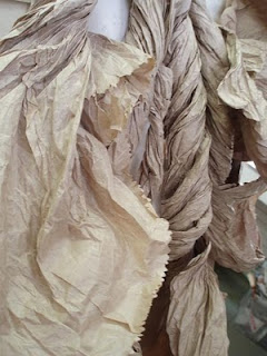
The brief for our constructed textiles module was to create a piece based on the sketches we made during our visit to Kew Gardens at the start of term. The piece had to be made on a female mannequin, but did not necessarily have to be an item of clothing.

Here are some of the final pieces:


Saturday 11 December 2010

Lousie Bourgeois: The Fabric Works at Hauser & Wirth

Entry: Free

This was the first time I'd been to Hauser & Wirth London and I spent some time wandering around and puzzling over the fact that the works that I'd seen on promotional material for the exhibition weren't on show. For anybody else going to Hauser & Wirth for the first time, don't be like me – find out in advance that Hauser & Wirth has two galleries and they have separate street entrances!

Tuesday 7 December 2010

Curatorial Project

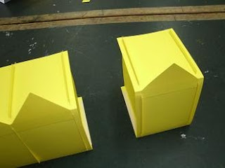
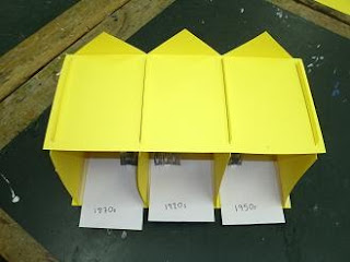
3D models made to accompany a presentation. These can be packed flat for easy transportation and as the interiors aren't fixed in place they can be taken out and replaced.


These were made for my curatorial project, a module based around designing an exhibition - where it would be held, what it would contain, why it was being put on, who would attend, and what extra events would accompany it. After six weeks the module ended with everyone presenting their exhibitions to the class along with a 3D model to help illustrate their talk.

This class was unbelievably difficult and involved a huge amount of work in a very short space of time. But at least I learnt how much I like making paper buildings.

Sunday 21 November 2010

Trash Fashion at the Science Museum

Entry: Free

This is probably the smallest exhibition I've ever visited. It contains just ten pieces and you can see nine of them on the Science Museum website (the missing one is Berber Soepboer's modular skirt*).

The exhibition isn't really about making fashion from trash, though that is a part of it. It's really about all the guises environmentally conscious fashion can take – recycled materials, biodegradable materials, and less wasteful and less polluting manufacturing techniques. It's interesting and, importantly, the clothes look wearable, which makes the techniques and materials being showcased seem more viable, but it's so small that it's pretty underwhelming.

There is slightly more in the form of a Flickr group that accompanies the exhibition, and which invites members of the public to submit images of their refashioned** clothing, but I feel like it's stuff that I've been seeing online for years. (And for every good piece, there's three that still look too obviously like the original garment.)

If you're going to the Science Museum anyway then it's certainly worth checking out, but it's probably not worth visiting just for this exhibition.

*I'd rather have Soepboer's colour-in dress though.

**Well, I guess it's a better term than upcycled.

Friday 12 November 2010

Papercraft

One of my college tutors set my class an interesting exercise recently. We were asked to each bring in an object and then make a 3D model of our chosen object from paper or card. The model had to be assembled without glue or tape and it had to be possible to dismantle it and pack it flat.
In the classroom I found the exercise to be agonisingly difficult, but later on inspiration struck and I was gripped with the desire to perfect it.
This was my object.


Version 1, made during the class. Far too complex with too many parts, it also required tape to hold it together. Utter failure.

Version 2. Inspired by the design of a FedEx box, I substantially revised the model, making it much simpler.

Version 3. It's not very easy to dismantle and pack flat, but it requires no glue or tape.

And it's wearable!

And just in case anybody out there is asking themselves “how on earth can I make a watch out of paper?”, here are my instructions for doing just that.

Sunday 7 November 2010

A Wet Weekend Camping in Wales

We spent a wet weekend camping in Wales.

We left in a rush.
We didn't notice the fat clouds rolling overhead -

The wind whipped around us -

And the rain poured down -


There was mud everywhere -

And the rain streamed and eddied down the hillside -


And washed everything out of our tent -


Paper bag costumes currently on display in reception at Morley College -


Book review: Tactile

I don't own much in the way of art books. I have a handful of craft books, mostly about knitting, but as I can get all the how-to information and a huge range of patterns online for free these don't seem like the best things to spend my money on. I do own a few books about art and artists, and I'd love to own more, but on the whole these books tend to be too expensive so I ask for them as presents.

Except one. Tactile: High Touch Visuals is the one art book that I had to buy as soon as I saw it.

I picked it up from a book stall at a craft fair for £20, which was an absolute bargain as amazon.co.uk is currently selling it for £26.99, and its actual retail price is £40. It's probably best summed up by its blurb: “a collection of cutting edge work that illustrates how designers from various disciplines are implementing their ides in three-dimensional space”. That's all there is to it really - design work that's 3-D rather than 2-D. It's published by Die Gestalten Verlag and edited by Robert Klanten, Sven Ehmann and Matthias Hübner.

There's very little text: a short preface, a brief introduction to each of the chapters, and the rest is just little captions giving the names of the artwork and artist, date, place, dimensions and materials used. Occasionally some pieces get a little extra bit of information, but there doesn't appear to be any rhyme or reason as to when this happens. The works themselves are split up into six chapters: Type & Poster; Objects, Scenes & Paper Works; Dressed Up; Products & Sculptures; Indoor Installations; and Outdoor Installations. They're pretty vague categories with some overlap between them, and I suspect you could remove the chapter headings with no ill-effects. (There's no contents page, so I think somewhere an editor must have had the same thought.)

But do text and organisation matter in an art book? For me, the point of an art book, and the deciding in factor in whether or not I want to own it, is the artwork inside and I love the artwork in Tactile. Regardless of the designer, the work on display is colourful, poppy and fun. There's lots of emphasis on people interacting with the works – wearing them, using them, making them, touching them, thinking about them. All the colour and energy and interest just make me want to make things, and I don't think I can say anything better about it than that. Here's three of my favourites:


Pattern, Samuel François, 2005

The Lady That Almost Disappeared, Fredrik Raddum, 2005

Relax Magical Hair Tour, Uchu Country, 2006

While writing this I discovered that Tactile has a sequel, Tangible, which I'll be adding to my ever-growing list of beautiful books that I can't afford.

Wednesday 3 November 2010

Felt

Hand-felting at college on Tuesday. Good grief! I love this technique so much!

Some thin, hole-riddled felt like a spider's web.

Stripes of green felt - felted onto calico. I blended the colour by carding some rovings and it does look better in reality.

Stripes of purple-orange felt - felted on to muslin.

Close-up showing how the felt pulls the muslin fibres.

Felt curls. Strands of felt dipped in a 50/50 mix of water and PVA glue and wrapped round a metal knitting needle until dry.


Felted ball - still whole...

And cut open.

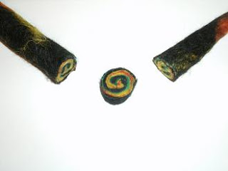
Felted stick. Whole...

And cut open!

Wednesday 20 October 2010

...

Since my last post I've moved house twice, been to the Frankfurt Book Fair with work and been ill, hence the utter neglect of this blog. Hopefully, I'll get round to updating more regularly again now. (Ha!)

Anyway, I picked up these in Frankfurt...

Octopus ink stamps!

And these two books were given to me by a colleague...


If I ever get round to using them I'll try and put up reviews. (Again, ha!)

Sunday 5 September 2010

A book based on a journey, part 3

Wrapping up the book project took much longer than I expected. I reached a stage where I knew what I wanted, but physically making it really dragged on. I drew up rough designs for each page and then created them as collages that incorporated my photographs, drawings and text.

The text ended up having two parts: computer text that explained the factual steps of the journey and handwritten text made up of personal anecdotes and relevant quotes.

Unfortunately, my very cheap glue made the collages too fragile, so I ended up scanning them into a computer and printing them off. While this stopped them from falling apart it did mean that I lost the varied textures of the original pages. I printed relevant sections of a London street map on to the backs of the pages.

I bound the pages using an excellent bookbinding tutorial from Toby Craig as a rough guide. I started off trying to bind them with cotton thread, but this proved too prone to getting tangled and I ended up using dental floss, giving the book's spine a lovely, minty-fresh smell. The cover was made with some heavy card I had lying around. While I left the front blank except for the title, I drew an abstract design based on a London street map page on the back.

So, am I happy with it? No. I'm pleased that I finished it in time and that I put lots of thought into it, but if I could start it again I'd do it all differently. It was fun though, and it was definitely a useful experience. If nothing else I'll definitely have another go at hand-binding a book in the not-too-distant future.