
Entry: Free
This is probably the smallest exhibition I've ever visited. It contains just ten pieces and you can see nine of them on the Science Museum website (the missing one is Berber Soepboer's modular skirt*).
The exhibition isn't really about making fashion from trash, though that is a part of it. It's really about all the guises environmentally conscious fashion can take – recycled materials, biodegradable materials, and less wasteful and less polluting manufacturing techniques. It's interesting and, importantly, the clothes look wearable, which makes the techniques and materials being showcased seem more viable, but it's so small that it's pretty underwhelming.
There is slightly more in the form of a Flickr group that accompanies the exhibition, and which invites members of the public to submit images of their refashioned** clothing, but I feel like it's stuff that I've been seeing online for years. (And for every good piece, there's three that still look too obviously like the original garment.)
If you're going to the Science Museum anyway then it's certainly worth checking out, but it's probably not worth visiting just for this exhibition.
*I'd rather have Soepboer's colour-in dress though.
**Well, I guess it's a better term than upcycled.


 The wind whipped around us -
 And the rain poured down -
 There was mud everywhere -
And the rain streamed and eddied down the hillside -

And washed everything out of our tent -

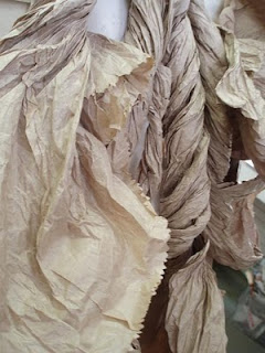
Paper bag costumes currently on display in reception at Morley College -


I don't own much in the way of art books. I have a handful of craft books, mostly about knitting, but as I can get all the how-to information and a huge range of patterns online for free these don't seem like the best things to spend my money on. I do own a few books about art and artists, and I'd love to own more, but on the whole these books tend to be too expensive so I ask for them as presents.
Except one. Tactile: High Touch Visuals is the one art book that I had to buy as soon as I saw it.
I picked it up from a book stall at a craft fair for £20, which was an absolute bargain as amazon.co.uk is currently selling it for £26.99, and its actual retail price is £40. It's probably best summed up by its blurb: “a collection of cutting edge work that illustrates how designers from various disciplines are implementing their ides in three-dimensional space”. That's all there is to it really - design work that's 3-D rather than 2-D. It's published by Die Gestalten Verlag and edited by Robert Klanten, Sven Ehmann and Matthias Hübner.
There's very little text: a short preface, a brief introduction to each of the chapters, and the rest is just little captions giving the names of the artwork and artist, date, place, dimensions and materials used. Occasionally some pieces get a little extra bit of information, but there doesn't appear to be any rhyme or reason as to when this happens. The works themselves are split up into six chapters: Type & Poster; Objects, Scenes & Paper Works; Dressed Up; Products & Sculptures; Indoor Installations; and Outdoor Installations. They're pretty vague categories with some overlap between them, and I suspect you could remove the chapter headings with no ill-effects. (There's no contents page, so I think somewhere an editor must have had the same thought.)
But do text and organisation matter in an art book? For me, the point of an art book, and the deciding in factor in whether or not I want to own it, is the artwork inside and I love the artwork in Tactile. Regardless of the designer, the work on display is colourful, poppy and fun. There's lots of emphasis on people interacting with the works – wearing them, using them, making them, touching them, thinking about them. All the colour and energy and interest just make me want to make things, and I don't think I can say anything better about it than that. Here's three of my favourites:
While writing this I discovered that Tactile has a sequel, Tangible, which I'll be adding to my ever-growing list of beautiful books that I can't afford.
 Stripes of green felt - felted onto calico. I blended the colour by carding some rovings and it does look better in reality.
 Stripes of purple-orange felt - felted on to muslin.
 Close-up showing how the felt pulls the muslin fibres.
 Felt curls. Strands of felt dipped in a 50/50 mix of water and PVA glue and wrapped round a metal knitting needle until dry.
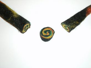
 Felted ball - still whole...
 And cut open.
 Felted stick. Whole...
 And cut open!