Friday 30 July 2010

Horrockses Fashions at the Fashion and Textile Museum

Entry: £6.50 adults / £3.50 concessions

My interest in textiles has never really translated into an interest in fashion. Clothes aren't something I care about in and of themselves, I'm more interested in the materials. Which is a nice way of saying that I wasn't particularly excited about this exhibition at the Fashion and Textiles Museum in Bermondsey.

I was completely wrong. Of the exhibitions on the list that I've been to so far, this was by far and away the best.

The exhibition focuses on Horrockses Fashions in their heyday, the 1940s and 1950s. Horrockses was a British firm specialising in off-the-peg women's clothing, which stopped trading in the early 1980s. They're remembered today for their brightly-patterned cotton dresses, but they also made evening dresses and housecoats, and had a children's range called Horrockses Pirouette. Having said that, it's easy to see why the company's remembered for the sun-dresses – they're so colourful! Even after 50 years the clothes on display look amazing, all bright,cheerful colours and crazy abstract patterns.

While there are plenty of clothes on display there's also lots of information about both the company and the designers that worked there. There are sketchbooks used by the company's designers on view, along with things like the garment sketches that were sent to the manufacturers. There's also lots about how they marketed their clothes, and the company really did appear to set about “positioning the brand” in a way that seems very modern. (One of Horrockses' best ideas was to commission pattern designs from contemporary artists such as Eduardo Paolozzi to supplement the work of their in-house design team. I have to say, it's quite a difference from Topshop's Kate Moss range)

So, it was informative, well-organised and colourful – I loved it and I may well be back on 24th September as Pat Albeck, one of Horrockses' key designers in the 1950s, will be discussing her work with curator Dennis Northrup that evening.

Tuesday 27 July 2010

Life Drawing at Candid Arts, Islington

As I'm currently on holiday I went to the Tuesday morning class this week. The daytime class is much quieter, so if you're looking for a session with more space and more individual tuition this is a good one to attend.

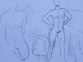
It was also the first male model I've had a chance to draw! Barry was an excellent model who went through a really varied range of poses. We had about an hour of 5 minute poses, a break and then a final 40 minute pose. I've erased and drawn over a lot of my 5 minute sketches, hence the relative lack of pictures.


Sunday 25 July 2010

Magnificent Maps at the British Library

Entry: Free

While this post bears the date that I attended this exhibition it was actually written some time afterwards. I really struggled to find anything to say about.

It's an exhibition of maps, held at the British Library. It's big, divided into eight large sections, and contains a huge range of maps from a wide selection of time periods and cultures. The show's sub-title is “Power, Propaganda and Art”, which should give you some clue as to the themes being explored. These are not A-Z street maps intended to help you navigate a town; these are sumptuous artworks intended to show learning, wealth, power and military might.

So why the difficulty in writing this post? I think my problem with the exhibition stemmed in part from its odd arrangement. The maps are supposedly arranged “according to the setting in which they were originally displayed”, the eight settings being the Gallery, the Audience Chamber, the Bedchamber, the Cabinet of Curiosities, the Street, the Merchant's House, the Secretary of State's Office, and the Schoolroom. I'm not at all convinced of these differences. Even after rereading the exhibition guide I don't see that the maps in the Gallery section differ hugely from the maps in, for example, the Secretary of State's office. There's also a few which I'm sure are in the wrong place. There's a Grayson Perry artwork on display that echoes a mappa mundi, a medieval world map, and which appears, very logically, alongside some real mappae mundi – in the section called “the Bedchamber”. Why bother with these silly divisions if you plan to ignore them anyway?

Rereading this it sounds like a fairly minor complaint even to myself, but I strongly believe that clear organisation is vital to a large exhibition. Both this and the Skin exhibition at the Wellcome Collection have an abundance of beautiful objects, but weak thematic organisation.

The other problem is that after five rooms of maps you might find yourself a bit tired of maps, and you'll still have three more rooms to go. There's some lovely oddities, such as the world's largest atlas, but my attention was beginning to wander after walls and walls of maps. The “Street” section came as a welcome change of pace, offering a selection of overtly political maps drawn from journals and newspapers. These were often satirical or humorous propaganda pieces from the twentieth century and they definitely livened the exhibition up.

In conclusion, it's a rather poorly arranged exhibition with lots and lots and lots of maps. Beautiful and interesting maps certainly, but mostly lots of maps.

Thursday 22 July 2010

Life Drawing at Candid Arts, Islington

The Thursday evening class has a different tutor to the Tuesday class. It also seemed to have a slightly slower pace, with fewer poses held for longer periods of time.


Tuesday 13 July 2010

Life Drawing at Candid Arts, Islington

Entry: £7 (charcoal 25p a stick, paper 25p a sheet*)

The Candid Arts Trust in Islington runs regular life-drawing classes, both during the day and in the evening. Evening classes take place 7pm 'til 9pm from Monday to Thursday and daytime classes take place 11am 'til 1pm on Tuesday and Wednesday. As I'd been advised to work on my observational drawing at my interview, and as these classes are conveniently close to my office, I headed there on a Tuesday evening after work.

These are drop-in classes, so there's no need to book a place, but they do stop letting people in at about 10 past. The classes are held in a large basement room and are clearly popular – there were probably between 20 and 30 people that evening. Despite the size of the class the teacher made a valiant attempt to go around and talk to everyone individually.

There was a huge range of abilities on show, so there's no need to feel intimidated at all. The teacher had the model go through 14 poses over the course of the class. These were of different lengths and the teacher suggested different drawing exercises for each pose, though you could just do your own thing if you preferred.


15 minute pose (no stipulations)

5 minute poses (no stipulations), followed by 5 minute poses (continuous line)

5 minute poses (continuous line drawn with off hand), followed by 5 minute poses (drawn with both hands simultaneously)


1 minute poses (not looking at paper), followed by 1 minute pose (not looking at paper drawn with off hand)


15 minute poses (no stipulations)

The session was split by a 10 minute break when you could look at other people's work, or head to the cafe upstairs for food or drink. It was an intense session - I'm not used to drawing for such an extensive period of time or working so quickly. But it was definitely useful and I left looking forward to going the following week!

*Or you can bring your own materials.


Sunday 11 July 2010

Skin at the Wellcome Collection

Entry: Free (exhibition guide £1*)

The Wellcome Collection is part of the legacy of Henry Wellcome (1853-1936), a pharmacist and businessman who amassed an amazing collection of medical artefacts. (The other part of his other legacy is the Wellcome Trust, a global charity supporting biomedical research.) Henry Wellcome's collection is best described as the history of medicine and medical thinking in physical form; any object that humans have used to improve their health and cure their illnesses was probably picked up by Henry Wellcome at some point. He also built up a huge collection of books, which now form the basis for the Wellcome Library. Both the library and the museum are open to the public and free to use, though you do have to register to use the library.

The Wellcome Collection also puts on temporary exhibitions, always with a medical or biological theme. The current temporary exhibition is Skin, curated by Javier Moscoso. Technically it's divided into five sections: Objects, the skin as both scientific and artistic object; Marks, the physical marks left on skin by age and disease; Impressions, the sensory qualities of skin; Afterlives, the skin after death; and Skin Lab, contemporary scientific developments and artistic practices that use them. In practice these divisions don't seem all that clear, with plenty of overlap between their contents, but this is a minor complaint.

It's an odd exhibition in some respects. Don't go expecting to learn medical facts – it won't tell you why you have moles or what causes eczema. It's really just about showing skin as a medical and artistic artefact in its own right and as an inspiration for other medical and artistic artefacts. Interestingly, while much of the art focuses on themes of identity and uniqueness, I left feeling that skin doesn't actually reveal as much of a person's identity as we'd like to believe. While it's a good signifier of our physical traits, (our age, our race, our health, our attractiveness), it ultimately revels nothing of our personalities, our memories, interests, desires, hopes and fears. And there seems to be a gap in the exhibition here – while the way we try to inscribe our personality on our skin is briefly touched on, it's left unexplored. There's mention of tattooing, but only as a signifier of inclusion to specific social groups (Maori tribes and South American convicts are the two groups mentioned). What about tattooing as a statement of personal identity? What about piercings? Scarification? Self-harm? There's a couple of exhibits about anti-ageing treatments, but what about make-up and body paint?

This isn't to say that it's a poor exhibition. Far from it; there are some beautiful, haunting, compelling things here, from 18th century anatomical drawings in which cadavers cheerfully peel back their skins for the reader, to Tamsin von Essen's recent series of ceramic jars afflicted with skin conditions. It's a genuinely intriguing mixture of scientific curiousities, social observation and artistic practice, but because it tries to cover all of these points at once it ends up covering none of them in depth. In the end, I felt that it concealed far more about human identity than it revealed.

*The guide contains a short story in addition to information about the exhibition, so you'll have something to read on the tube ride home.

Saturday 10 July 2010

Save Our Souls

I tripped over a little exhibition on my way to Liverpool Street Station. Afterwards I found out that it was the Camberwell Illustration Degree Show, running from the 8th to the 13th July.

Favourites?
Nina Malysheva's collages.
Stephanie Kirchum's realistic pencil drawings of weird hybrid animals. (Stephanie doesn't appear to have a website of her own, but you can see her work on the Save Our Souls website.)
Cait Peterson's cartooning, especially her children's book “My Brother Is a Zombie”, which is available from Lulu.

Thursday 8 July 2010

A book based on a journey, part 1

As soon as I read the brief - “a book based on the theme of a journey” - an idea popped into my head: my journey would be my journey to work. It's a journey I make five days a week, and that I make in reverse five days a week. I know it well, yet every time it's different. On the surface it's utterly banal as a subject, but I wanted to show the depth to this journey; I wanted to show its variety and possibilities, which are only created through its repetition.

Of course, I'm also wary of ideas that leap fully formed into my mind. I put it to one side and forced myself to come up with some other ideas. They are, (in the order that I came up with them):

  • a salmon returning to spawn – it's an interesting journey, but I don't think I feel very compelled to write about fish.

  • Scott's Antarctic Expedition – I imagined the images becoming increasingly obscured by snow until the final page, which would be completely white.

  • a journey into space! – this caught my attention for a long time. I thought about basing this on the fake mission to Mars currently being run by the Russian Institute for Medical and Biological Problems. The six-man crew is spending 250 days in a fake spacecraft, 30 days exploring a fake Martian landscape, and then another 240 days in the fake spacecraft flying home. This 520 day project is intended to reveal to scientists the psychological effects of such a prolonged period of isolation so they can ensure the success of a manned mission to Mars in the future. Read more about it here. While I still love the idea of a fake journey I was very unsure about the form this book would take.

I kept coming back to the original idea and so I decided to flesh it out a bit more. As I wanted this to be all about the repetition of the journey, I envisioned having the same journey repeated five times (for the five weekdays), but each time have a different interruption to the journey. An interruption being something unique to that journey, such as a new piece of art, witnessing a fight or a new shop opening. The regular journey would be black and white, but the interruptions would be colourful and possibly larger than the rest of the book, requiring folding out to see them in full.

I started by breaking down my journey into 10 stages, intending to have these 10 stages as 10 pages that remained identical. I would then have five “interruption” spreads, and each time one of these would be inserted at random. However, five spreads would only give me four spaces to put my interruptions. I'd need 12 stages to the journey to get the five interruptions that I wanted. So, the journey would be 12 pages long, plus a two page interruption, and it would repeat five times. This is when I realised that 14 pages multiplied by five is 70, and suddenly this seemed like a very big book.

I decided to do two things: first, take a series of photographs of my journey to work and second, rethink the layout to create something more manageable.

Wednesday 7 July 2010

Holiday homework

On 7th July I received my “holiday” homework.* There are two parts to it: a list of exhibitions to visit if possible and a project to work on over the summer.

The exhibition list is a mixture of textile and non-textile shows, (presumably to encourage us to broaden our horizons). Below is the list along with my annotations regarding closing dates and prices:

Textiles Advanced Workshop @ Morley College Gallery
July 15
th – FREE

Henry Moore @ Tate Britain
August 8
th – £12.50

Architects Build Small Spaces @ V&A
August 30th – FREE

Maison Martin Margiela @ Somerset House
September 5th – £6

Sustainable Futures @ Design Museum
September 5th – £8.50

Magnificent Maps @ British Library
September 19th – FREE

Wolfgang Tillmans @ Serpentine Gallery
September 19th – FREE

Skin @ Wellcome Collection
September 26th – FREE

Horrockses Fashions @ Fashion & Textile Museum
October 24
th – £6.50

The Ministry of Food @ Imperial War Museum
January 3rd – £4.95

Trash Fashion @ Science Museum
February 2011 – FREE

Well, now I regret not going to the Imperial War Museum when James' parents were paying! Cash concerns aside, it's an interesting list. I have high expectations for “Skin” as I saw the “Heart” show at the Wellcome Collection back in 2007 and that was brilliant. I'm also looking forward to “Magnificent Maps” and “Trash Fashion”. I'm less excited about Henry Moore, (mostly because of the price), and Maison Martin Margiela, (because I've never heard of it/them). I was definitely intrigued to learn that the Fashion and Textile Museum is pretty close to my flat – I had no idea.

And now to the project. I don't know why, but I'd got the impression it would be some sort of research thing. It's not. Here's the brief:

The project this year is to make a book based on the theme of a journey.

The journey that you chose could be a very small one such as, the journey of an ant through the grass, or your once in a lifetime trip to Bermuda – or something in between.


The book can be constructed in any form, can be made from any sort of materials and marks can be made using any media.

The project will be getting a much longer entry at a later date!

*I'm working full time until the week the course starts. It's really only holiday work from the point of view of the tutor!

Saturday 3 July 2010

New Designers 2010 at the Business Design Centre

I almost missed the New Designers show. I knew it was coming up and that it was a show I should try to see, but I didn't realise it was only on for four days. When I did find out it was day three already and there was no chance I could stop by on day four, so I set off straight away.

The New Designers show is really two shows, both lasting four days with a three day break between them. The first show, the one I was interested in, is made up of four disciplines: Textiles, Fashion and Accessories; Contemporary Applied Arts; Ceramics and Glass; and Jewellery and Precious Metalwork. This time I did manage to bring a notebook and jot down the who did what, (though, sadly, photography wasn't allowed in most of the exhibition so no photos are available), but that's not to say that everything went smoothly. When websites tell you it's cheaper to book online you might want to look into that rather than assuming it's going to be a 50p discount. It might turn out to be more like a £5 discount and you might end up kicking yourself. Also, with hindsight I should have gone earlier and broken things up with lunch. As it was I left after an amazing hour and a half convinced that I'd missed loads, but suffering from complete visual overload.

Originally, I'd planned to write a bit about each of my favourite exhibits from the show, but as I left with a favourites list that had 27 people on it I decided to scale back a bit! After some agonising, here's my top three:
  • Amelia Fever – she makes animal-skin shrugs and wraps, except that the animals are fake. This is a terrible description that doesn't do justice to Fever's clever and funny designs. The galleries on her website are a much better explanation.
  • Koji Shiraya – Koji actually works with ceramics rather than textiles. I loved his series of vessels with lids that looked as if they were melting; I like the contrast between the appearance of the object and the medium's actual physical properties. Looking at his webiste it seems that he plays a lot with textures.
  • Eva Joly – Eva produces printed designs based on very mundane domestic imagery. She manages to make the everyday eye-catching. She's also fascinated by the CMYK printing process and experiments with different colour combinations in her designs.